Touring the Marcel Breuer House at the Rockefeller Estate
An insider outing to the celebrated mid-century home in Pocantico Hills
Mid-century is definitely a thing right now. Mainstream brands such as Crate & Barrel or West Elm are dominated by MCM reproductions. First Dibs and Chairish are practically entirely MCM. But a mid-century house is a whole other thing. These homes are quirky and not for everyone. I know, because I live in one!
My house was built by my husband's Uncle Leonard. Uncle Leonard was not a famous architect, but he studied under Mies van der Rohe in Chicago. So, in 1958, when his sister (my mother-in-law) asked him to design her house in Irvington, he did what he knew. I am aware how lucky I am to live in what is basically a work of art, and because of this, I’ve developed a fascination to seek out other homes like mine – to learn more history and find inspiration.
So when I got an opportunity to visit The Breuer House at Pocantico Hills, which is rarely open to the public, I jumped. The house is maintained by The Rockefeller Brothers Fund, which is also responsible for The Pocantico Center, including David Rockefeller Creative Arts Center.
In 1947, during the postwar boom, Cape Cod style houses were exploding in Levittown, Long Island. The Museum of Modern Art in New York curated a show on how middle class houses could be both affordable and well designed. They enlisted Marcel Breuer, a Bauhaus trained architect, to create the ideal suburban home for the average American family – it needed to be modern, expandable, and attainable. A spec house model was erected in the Sculpture Garden at the museum on 53rd Street, and the architecture on display was intended to be easily replicable. In fact, anyone could buy a set of the plans at MoMA and take them to their local builder. The show was well received and got great reviews.
In 1950, John D. Rockefeller purchased the spec house, because it would have been torn down otherwise! It was cut into four pieces, loaded onto a truck and driven 20 miles north to the family’s 250-acre estate in Sleepy Hollow. Fitted with electricity and plumbing, it was used for the next 50 years as a guest house by various members of the Rockefeller family.
In 2007, the house became part of the National Trust for Historic Preservation and underwent a major restoration, including historically-correct furnishings and period fabrics. Appliances were updated, window treatments changed, paint retouched, and furnishings added and subtracted, including pieces designed by Breuer himself. Because a catalog and detailed architectural drawings had been created for the MoMA exhibition, the restorers were able to keep close to Breuer’s original intentions. They were also given the challenge to create a house that could be actually lived in.
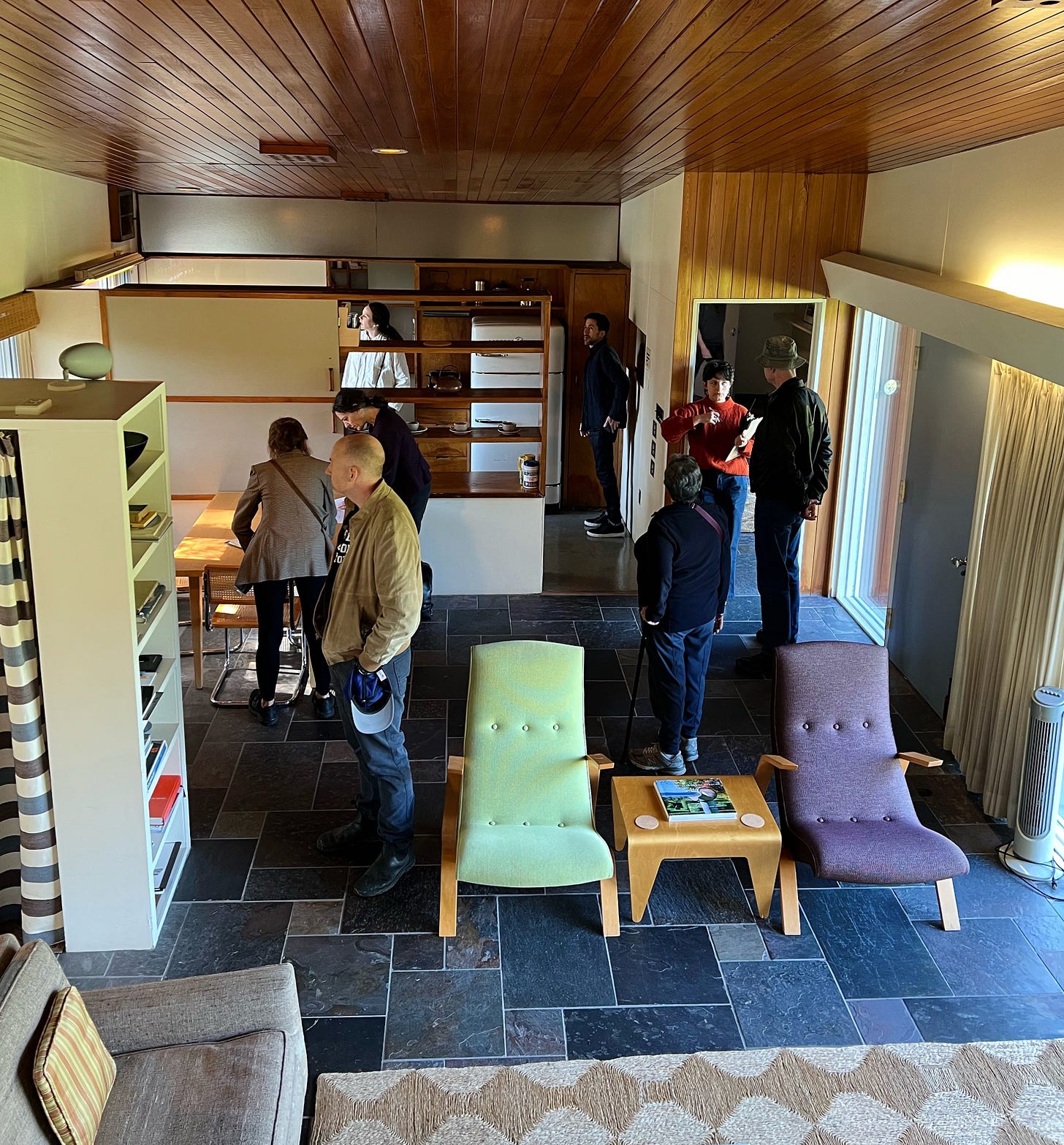
A mix of original and re-issued pieces were compiled. Luckily, Isokon had recently reissued Breuer’s bent plywood nesting tables; a set of three were the first pieces purchased for the restoration. I personally love the Saarinen Grasshopper chairs that were re-upholstered in green and purple using a Knoll fabric almost exactly like the original. Lighting was a problem for Breuer, because he could never find anything he liked. A version of Tolomelo lamps were installed in almost every room. I had chosen them during our own renovation, because I really liked them and they just seemed to fit. I didn’t realize I wasn’t the only one who thought that!

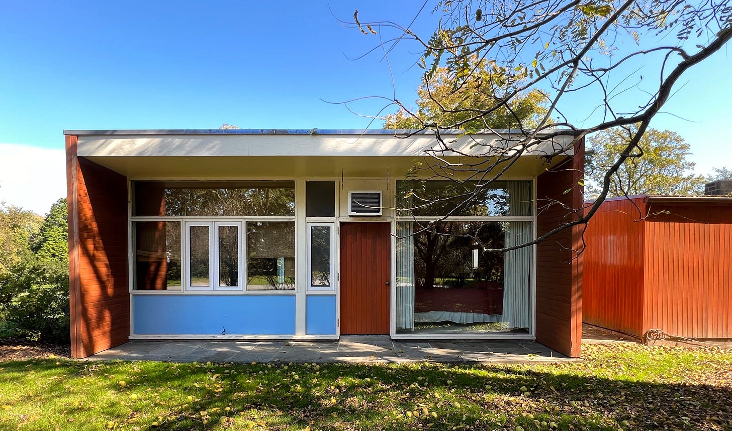
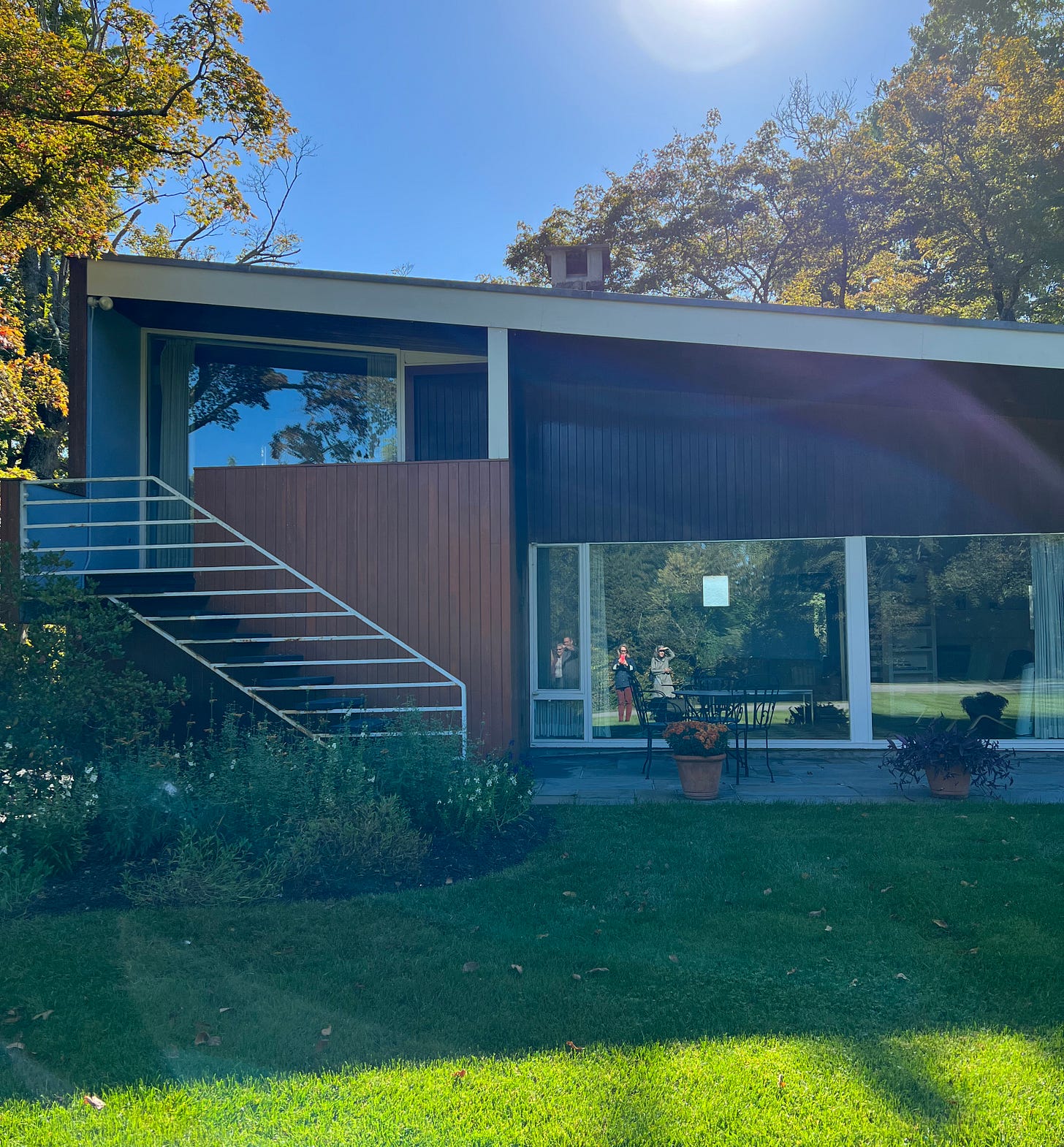
The house includes an open living-dining space, with bedrooms on either end, allowing children to be in a separate zone from the parents. The children’s playroom has a sliding window into the kitchen, allowing some separation but also a way for parents to keep an eye on them. Later, the playroom had been turned into an office. The use of glass, wood and stone, plus the “activity zone” design are what ultimately makes the modern house feel different than a Cape House.
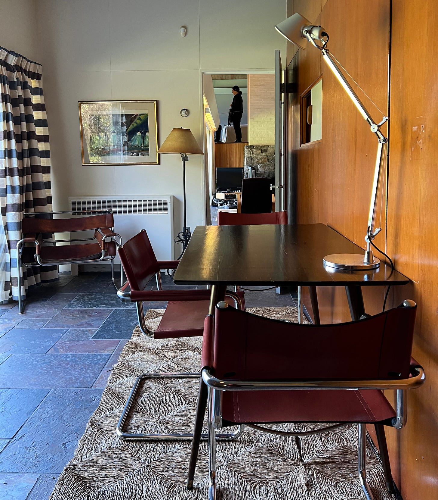
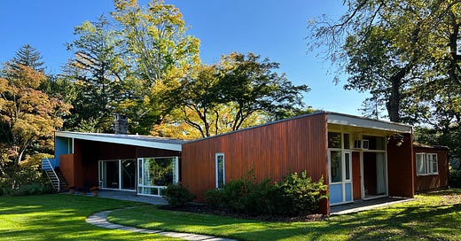
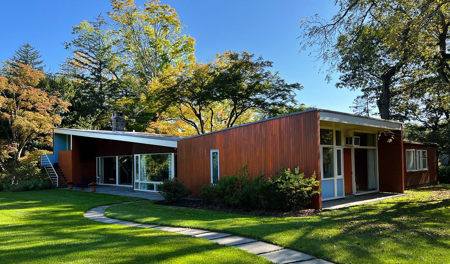
For a relatively small space, Breuer’s house feels much larger because of the many floor-to-ceiling windows and an abundance of natural light. To compensate for the smaller footprint, most of the finishes on the ceilings, floors and walls match the outside, giving it all a more spacious feel. The underside of the outdoor overhang, for example, is the same color as the interior ceilings. And the living room floor is almost an exact match to the bluestone patio, which makes the living room feel bigger than it is.
Today, the house is maintained by the Rockefeller Brothers Fund. Part of the reason tours are so rare is because it is actually in use. The artist-in-residency program with The David Rockefeller Center allows for artists to actually live in the house during their stay at the program. (Be sure to sign up for the DR newsletter to be notified of the next tour and more excellent programming.)
I returned to my house, which was built ten years after Breuer’s. I was able to notice even more similarities – the butterfly roof, open-air shelves dividing the kitchen and dining areas, sliding doors in practically every room (which, by the way, do not work well in humid months), floor-to-ceiling windows. I’ve always appreciated that almost every room has a door leading outside (except for the kids rooms). I never knew that these were standards in mid-century architecture, and not just something Uncle Leonard did because of his sister’s preferences!





Great article. I learned a lot and especially liked the comparisons to your house. It made the historical design more relatable.